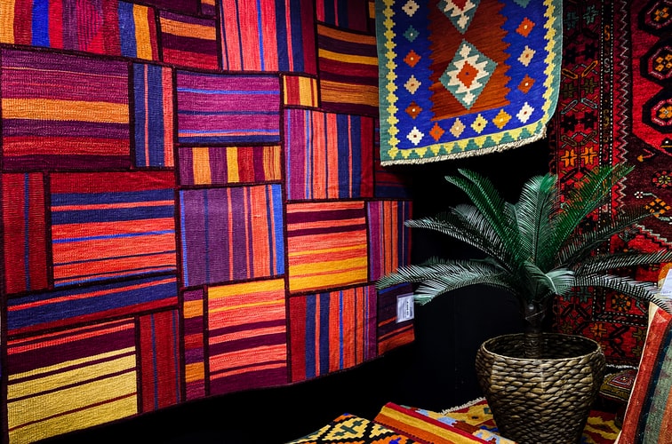
Color theory is the psychology of using color in art. It is essential to how people perceive art. Colors group into three categories; primary, secondary, and tertiary. They are necessary to know because you can find the perfect color palette for your tapestry to match your room with the color wheel.
To make it simple, we have gathered the different color schemes that may help you get custom tapestry from Fine Art America.
Why is it important?
If you have the basic knowledge of color schemes, it will help you wisely choose the tapestry you want that would not make you regret it. Wall tapestries take up quite a lot of space, and they are usually the first thing the viewer catches, so it’s best that your room isn’t overwhelming with colors, to make it a pleasant experience for everyone.
Color Psychology
Color psychology is also important to know to figure out how you want to start. You may or not be surprised, but each color sets off a different mood. Blue brings forth tranquility and security, while yellow is quite uplifting and energetic; it makes you feel creative. Once you familiarize yourself with the colors, customizing your tapestry will be a piece of cake.
Complementary
Complementary colors are those which are on the opposite ends of the color wheel. For example, blue in the color wheel is yellow, while it is green with the color red. There is a sharp contrast between them, which gives the place a vivid pop. Apparent differences between them will correspond because they share a standard primary color.
Analogous
Analogous colors are those which come in pairs; for example, red, orange, and yellow. There must be one dominant color for this scheme to work while the rest of it is submissive. The latter will act as a support and will give an exciting accent. They are incredibly pleasing to the eye and are easy to achieve if you are not well acquainted with colors.
Triadic
Triadic color schemes shaped in a triangle have equal spacing between them. They tend to be quite dynamic and create a beautiful contrast while still keeping harmony.
Color is a powerful tool that can be useful to change the appearance of any room. It can influence the size of the space. White, blue, and green tones make the room brighter and visually larger, whereas darker shades of colors make the room appear significantly smaller. This effect occurs because paler colors reflect and multiply light, making space look more open, while dark colors absorb light and adversely impact the surroundings.
However, that does not mean you make your room stark white. This tactic can make the room feel unwelcoming. While choosing a tapestry, make sure your goal is to create a welcoming environment.
Parting Words
It is not a simple task to decorate your room with wall art. You require a keen eye and a basic understanding of design principles. You can choose whichever color scheme and have it work by knowing the fundamental things to make the room’s harmony look beautiful.